
Chart 4 is very similar to chart 1: it is dynamic (the number of columns depends on the quantity of months provided) and columns are rendered horizontally. The idea behind scripting this chart is the same: after a successful AJAX call data gets passed to a function that organises data and prepares it for chart rendering. Once it’s prepared, it then passes the data to the rendering function.
const renderChart4 = (colorArrayForChart4, stripLinesArrayChart4, dataPointsArrayChart4, startAndEndDate = " ") => {
     //code to render chart
}
const organizeDataForChart4 = (dataForTransferTypeChart, distinctMonths, transferTypesNamesArray, startAndEndDate = " ")=>

     //code to prepare data for the chart to be rendered

     //once data is ready send it to this function to render the chart
     renderChart4(colorArrayForChart4, stripLinesArrayChart4, dataPointsArrayChart4, startAndEndDate);
}

//1st this function gets called on successful AJAX call to back end
organizeDataForChart4(response.dataForTransferTypeChart, response.distinctMonths, response.transferTypesNamesArray, startAndEndDate);
Preparing data for chart
As this chart is very similar to chart 1, I will not go into details explaining what the code below does. There a a few minor changes compared to chart 1, but eventually the end result is the same: arrays for colours, strip lines and data are filled in this function, that gets passed to the function that renders the chart.
 const organizeDataForChart4 = (dataForTransferTypeChart, distinctMonths, transferTypesNamesArray, startAndEndDate = " ")=> {
	let monthCount = Object.keys(distinctMonths).length;
	if (monthCount>0) {
		let transferTypesCount= Object.keys(transferTypesNamesArray).length;
		let transferTypesNamesWithMonth;
		let dataPointsArrayChart4 = [];
		let label = "";
		let y;
		let colorArrayForChart4 = [];
		let stripLinesArrayChart4 = [];
		let startValue =-0.5;
		let endValue =  transferTypesCount - 0.5;
		let color ="#e6e6e6";
		let labelColor ="#000";
		for (let i = 0; i <monthCount; i++) {
			for (let x=0; x<transferTypesCount; x++) {
				//label value;
				label = transferTypesNamesArray[x]+" "+distinctMonths[i];
				//pallet quantity
				y = dataForTransferTypeChart[transferTypesNamesArray[x]][distinctMonths[i]];
				dataPointsArrayChart4.push({label, y});
				//color bar charts
				colorArrayForChart4.push(multipleGreenRed[x]);
				//COLOR EVERY SECOND MONTH TRANSFER TYPES IN GREY
				stripLinesArrayChart4.push({value: (transferTypesCount*i+x), label: label, labelPlacement: "outside", labelBackgroundColor: "white", color: "transparent", labelFontColor: labelColor});
			}
			 //adding striplines to create a grid in the chart
			 if(i==0) {
				//add default values on first iteration
				stripLinesArrayChart4.push({startValue, endValue, color});
				labelColor ="#737373";
			 } else if (i % 2 == 0) {
				labelColor = "#737373";
				startValue+=(transferTypesCount*2);
				endValue+=(transferTypesCount*2);
				stripLinesArrayChart4.push({startValue, endValue, color});
			 } else {
				 labelColor ="#000";
			 }
		}
		let chart4InnerContainerHeight = monthCount*transferTypesCount*20;
		//original height of inner container is 480px, so only change the style of this container if the chart4InnerContainerHeight value is higher the 480
		if (chart4InnerContainerHeight> 480) {
			chart4InnerContainerHeight +="px";
			document.getElementById("chart4InnerContainer").style.height = chart4InnerContainerHeight;
		}
		renderChart4(colorArrayForChart4, stripLinesArrayChart4, dataPointsArrayChart4, startAndEndDate);
	} else {
		renderChart4(multipleGreenRed, emptyTransferTypeEmptyLabels, emptyValueArray);
	}
}
As this chart is dynamic, at the end of the above script there is a code that changes the height of chart 4 container in order to avoid a cramped chart.
Rendering Chart 4
The code below renders chart 4. It’s practically identical to chart 1 code, just that it renders a different chart.
const renderChart4 = (colorArrayForChart4, stripLinesArrayChart4, dataPointsArrayChart4, startAndEndDate = " ") => {
	 CanvasJS.addColorSet("customColorSet2", colorArrayForChart4);
	 let chart = new CanvasJS.Chart("chart4InnerContainer", {
	  theme: "light1",
	  animationEnabled: true,
	  exportEnabled: true,
	  colorSet: "customColorSet2",
	  title: {
		fontSize: 20,
	  },
	  axisX: {
		titleFontSize: 20,
		labelFontSize: 14,
		interval: 1,
		tickPlacement: "inside",
		stripLines: stripLinesArrayChart4,
		//removes all labels from axes, later on they are added but as stripLines and with colors.
		labelFormatter: function(e) { 	return "";}
	  },
	  axisY2: {
		title: "Pallet Quantity",
		titleFontSize: 20,
		labelFontSize: 14,
		includeZero: true,
	  },
	  data: [{
		type: "bar",
		indexLabelFontSize: 14,
		axisYType: "secondary",
		indexLabel: "{y}",
		dataPoints: dataPointsArrayChart4
	  }]
	});
	chart.render();
	chart.title.set("text", "Monthly transfers by type "+startAndEndDate);
}
And the final result looks like this:
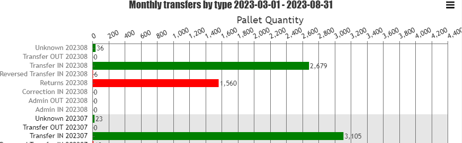
As with chart 1 I coloured every second background (in this occasion it is every second month), applied different colour for every second months labels to make it easier to distinguish different months data.
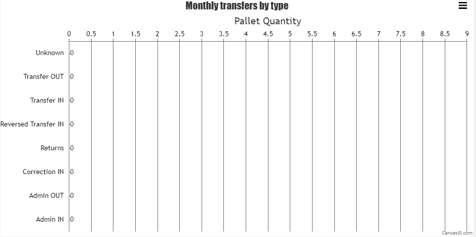
Render empty chart
I’m pretty sure this can be done in a more elegant way, but I’m short on time and want to finish this project as soon as possible, so will go the easy way. In order to draw an empty chart I just I created empty arrays that store 0 values and passed them to the renderChart4() function. As this empty function is called in two different locations inside the script I moved emptyTransferTypeEmptyLabels and emptyValueArray to the top of the JavaScript file and made them global variables, so that they can be accessed from different functions.
renderChart4(multipleGreenRed, emptyTransferTypeEmptyLabels, emptyValueArray);Example of empty arrays is demonstrated below:
//GLOBAL VARIABLES TO DRAW EMPTY CHARTS
let emptyTransferTypeEmptyLabels = [
	{value: 0, label: "Admin IN", labelPlacement: "outside", labelBackgroundColor: "white", color: "transparent", labelFontColor: "black"},
	{value: 1, label: "Admin OUT", labelPlacement: "outside", labelBackgroundColor: "white", color: "transparent", labelFontColor: "black"},
	{value: 2, label: "Correction IN", labelPlacement: "outside", labelBackgroundColor: "white", color: "transparent", labelFontColor: "black"},
	{value: 3, label: "Returns", labelPlacement: "outside", labelBackgroundColor: "white", color: "transparent", labelFontColor: "black"},
	{value: 4, label: "Reversed Transfer IN", labelPlacement: "outside", labelBackgroundColor: "white", color: "transparent", labelFontColor: "black"},
	{value: 5, label: "Transfer IN", labelPlacement: "outside", labelBackgroundColor: "white", color: "transparent", labelFontColor: "black"},
	{value: 6, label: "Transfer OUT", labelPlacement: "outside", labelBackgroundColor: "white", color: "transparent", labelFontColor: "black"},
	{value: 7, label: "Unknown", labelPlacement: "outside", labelBackgroundColor: "white", color: "transparent", labelFontColor: "black"}
]
let emptyValueArray = [
	{ y: 0, label: "Admin IN"},
	{ y: 0, label: "Admin OUT"},
	{ y: 0, label: "Correction IN"},
	{ y: 0, label: "Returns"},
	{ y: 0, label: "Reversed Transfer IN"},
	{ y: 0, label: "Transfer IN"},
	{ y: 0, label: "Transfer OUT"},
	{ y: 0, label: "Unknown"},
]
Empty chart looks like this
And that is practically it! Just a couple minor things left to do, like tidy up the code, add a user guide that explains how to download Transaction report properly and some styling to do and I can close this project! 🙂
Github.com repository has been updated.