
So how I’m going to monitor CHEP pallets? I have an idea for a single page website, with input field to upload the excel file from https://my.chep.com/ that would produce a horizontal bar chart.
I do remember using excel file on my first version of Shortage Report, so I know it is possible to extract data from excel file and use it with JavaScript, PHP and SQL.
The whole idea is this:
- Upload excel file from CHEP website (preferably half years transactions).
- Extract necessary data from this file and store it in database.
- Then with SQL query data to retrieve what is required for a chart (suppliers names and a sum of pallets for each supplier for each month).
- Use results to generate a horizontal chart at front end (for example if it is half year transactions, draw 6 bars in horizontal chart for each supplier)
The horizontal chart should look like this:
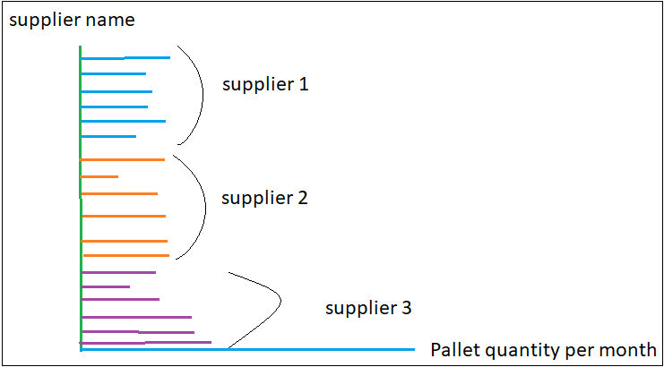
Each supplier would be assigned a different color. This way if there is a bar chart that is unusual (too high or too low compared to other months) it would be easy to spot it and investigate. The only problem is that I’m working for 12 days straight now, and don’t have time to sit down and start coding 🙁