
In order to colour chart bars I created an array named colorArray. I added 10 different hex codes to this array.
const colorArray = ["#408000", "#b3b300", "#cc3300", "#0059b3", "#cc7a00", "#5c5c8a", "#739900", "#997300", "#990073", "#2d5986"];The logic of colouring bar charts is this: individual suppliers bar charts are coloured with one colour to make it easy to distinguish them from other suppliers in a chart. To add colours to the chart I use this code:
CanvasJS.addColorSet("customColorSet1", colorArrayForChart1);colorArrayForChart1 is an array that stores all colour values for this chart. I fill this array with colour hex codes inside nested loop like this:
                let colorArrayForChart1 = [];
		let colorIndex = 0;
		for (let i =0; i< supplierCount; i++ ){
			 for (let x=0; x< monthCount; x++){
				colorArrayForChart1.push(colorArray[colorIndex]);
			 }
			colorIndex++;
			 if(colorIndex === 10) {colorIndex = 0;}
                 }
I use a colorIndex variable to determine when to start adding colours from colorArray anew: it means that every time 10 colours are used for 10 suppliers from colorArray, the nested loop will start picking colours from colorArray‘s 0 index.
Once the colorArrayForChart1 is filled, it is sent to renderChart1() function.
renderChart1(colorArrayForChart1, stripLinesArray, dataPointsArray); In the code sample below I marked the code responsible for colouring the chart, so it is visible how it blends in the organizeDataForChart1 and renderChart1 functions .
const renderChart1 = (colorArrayForChart1, stripLinesArray, dataPointsArray) => {

	CanvasJS.addColorSet("customColorSet1", colorArrayForChart1);

	 let chart = new CanvasJS.Chart("chart1InnerContainer", {
	  theme: "light1",
	  animationEnabled: true,
	  exportEnabled: true,
	  colorSet: "customColorSet1",
	  title: {
		text: "Monthly pallet transfers by supplier",
		fontSize: 20,
	  },
	  axisX: {
		titleFontSize: 20,
		labelFontSize: 14,
		tickPlacement: "inside",
		stripLines: stripLinesArray,
		//removes all labels from axisX, later on they are added but as stripLines and with colors.
		labelFormatter: function(e) { return "";}
	  },
	  axisY2: {
		title: "Pallet Quantity",
		titleFontSize: 14,
		labelFontSize: 14,
		includeZero: true,
	  },
	  data: [{
		type: "bar",
		indexLabelFontSize: 14,
		axisYType: "secondary",
		indexLabel: "{y}",
		dataPoints: dataPointsArray
	  }]
	});
	chart.render();
}
//in this array I will store individual colors for chart 1
const colorArray = ["#408000", "#b3b300", "#cc3300", "#0059b3", "#cc7a00", "#5c5c8a", "#739900", "#997300", "#990073", "#2d5986"];
const organizeDataForChart1 = (chartData, distinctSuppliersNamesArray, distinctMonths) => {
	//count object keys to determine the length of the object
	let supplierCount = Object.keys(distinctSuppliersNamesArray).length;
	let monthCount = Object.keys(distinctMonths).length;
	//if supplier count at least 1, a chart will be drawn, else an empty chart will be drawn.
	if (supplierCount > 0) {
                //these array's will be filled inside the loops, and later passed to renderChart1 function
	        let colorArrayForChart1 = [];
	        let dataPointsArray = [];
                //a variable to store suppliers name+month value.
	        let label = "";
                let y;
	        let stripLinesArray = [];
	        //start/end values for strip line
	        let startValue =-0.5; //because the bar chart is in the middle of zero, it start at -0.5 and ends at 0.5
	        let endValue =  monthCount - 0.5;
	        //color for strip line
	        let color ="#e6e6e6";
		let colorIndex = 0;

		for (let i =0; i< supplierCount; i++ ){
			 //compose the array for dataPoints that will be used to draw the chart
			 for (let x=0; x< monthCount; x++){
				label = distinctSuppliersNamesArray[i]+" "+distinctMonths[x];
				y = chartData[distinctSuppliersNamesArray[i]][distinctMonths[x]];
				dataPointsArray.push({label, y});
				//fill array color
				colorArrayForChart1.push(colorArray[colorIndex]);
				//COLOUR SUPPLIERS NAME AND MONTH
				stripLinesArray.push({value: (monthCount*i+x), label: label, labelPlacement: "outside", labelBackgroundColor: "white", color: "transparent", labelFontColor: colorArray[colorIndex]});
			 }
			colorIndex++;
                        //if all 10 colors in the color array has been used, reset the counter, and start filling the colorArrayForChart1 with
			 if(colorIndex === 10) {colorIndex = 0;}
                         //draw a grey strip line on the chart for every second supplier
			 if(i==0) {
				//add default values on first iteration
				stripLinesArray.push({startValue, endValue, color});
			 } else if (i % 2 == 0) {
				startValue+=(monthCount*2);
				endValue+=(monthCount*2);
				stripLinesArray.push({startValue, endValue, color});
			 }
		 }
	//call the function to render the chart
	renderChart1(colorArrayForChart1, stripLinesArray, dataPointsArray);
	 } else {
		 //draw empty chart
	 }
}
The image below demonstrates how this colouring adds changes to the chart.
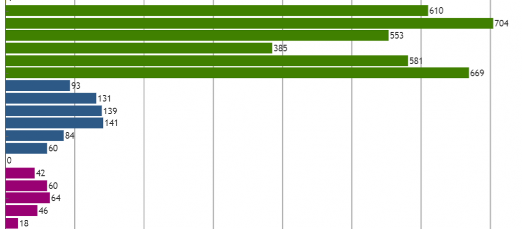
Now this looks a lot more helpful to observe pallets delivered by each supplier month by month doesn’t it? 🙂 And I’m still not done with colouring the chart, in my next post I will add some more colouring, to make the chart look even better!