
In this post I will brief out how I added chart bars to chart 1. In order to demonstrate how the code I wrote works, I will first explain the parts of code individually, and then will highlight the relevant code inside finished functions. Will do the same in next posts related to chart 1 as well.
Adding bars to chart
In the sample code from canvasJS.com I can see that for a bar chart to be rendered, data has to be structured in an array of objects [ {key:value, key:value }{ key:value, key:value} ].
dataPoints: [
      { label: "Learning Colors", y: 4.91 },
      { label: "Uptown Funk", y: 4.96 }
]
I declared a dataPointsArray array variable to store all the data for chart bars in it. dataPointsArray will be filled inside a nested loop with two properties:
	        let label = "";
                let y;
The label property will store a suppliers name combined with month, y will store pallet quantity. The label value will be constructed inside nested loop by simply concatenating suppliers name and month like this:
label = distinctSuppliersNamesArray[i]+" "+distinctMonths[x];When trying to assign a value to y variable inside a nested loop I came into a little problem: as the resultArray in back end is structured in a way where it’s keys are suppliers names, I can’t loop it using iteration count x. I could change the way the resultArray is structured at back end by adding one more dimension to it that would posses keys as numeric values, however I already have an array distinctSuppliersNamesArray in which the suppliers names are stored in the same order as in resultArray, and I can access the value by using number as a key.
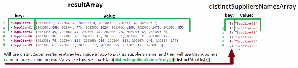
And this approach, when I first access suppliers name inside distinctSupplierNamesArray by using numeric index as a key, and then use the suppliers name to acces resultArray value did the trick. The code for assigning value to y in each nested loop iteration looks like this:
y = chartData[distinctSuppliersNamesArray[i]][distinctMonths[x]];The finished code to fill dataPointsArray array with data inside nested loops looks like this:
	        let dataPointsArray = [];
	        let label = "";
                let y;
		for (let i =0; i< supplierCount; i++ ){
			 for (let x=0; x< monthCount; x++){
				label = distinctSuppliersNamesArray[i]+" "+distinctMonths[x];
				y = chartData[distinctSuppliersNamesArray[i]][distinctMonths[x]];
				dataPointsArray.push({label, y});
			 }
                }
Once the dataPointsArray is filled, it is sent to renderChart1() function.
renderChart1(colorArrayForChart1, stripLinesArray, dataPointsArray); To demonstrate how the the code above blends in the finished JavaScript code, I have marked the parts of code responsible for rendering bar charts in green.
const renderChart1 = (colorArrayForChart1, stripLinesArray, dataPointsArray) => {
CanvasJS.addColorSet("customColorSet1", colorArrayForChart1);
let chart = new CanvasJS.Chart("chart1InnerContainer", {
theme: "light1",
animationEnabled: true,
exportEnabled: true,
colorSet: "customColorSet1",
title: {
text: "Monthly pallet transfers by supplier",
fontSize: 20,
},
axisX: {
titleFontSize: 20,
labelFontSize: 14,
tickPlacement: "inside",
stripLines: stripLinesArray,
//removes all labels from axisX, later on they are added but as stripLines and with colors.
labelFormatter: function(e) { return "";}
},
axisY2: {
title: "Pallet Quantity",
titleFontSize: 14,
labelFontSize: 14,
includeZero: true,
},
data: [{
type: "bar",
indexLabelFontSize: 14,
axisYType: "secondary",
indexLabel: "{y}",
dataPoints: dataPointsArray
}]
});
chart.render();
}
//in this array I will store individual colors for chart 1
const colorArray = ["#408000", "#b3b300", "#cc3300", "#0059b3", "#cc7a00", "#5c5c8a", "#739900", "#997300", "#990073", "#2d5986"];
const organizeDataForChart1 = (chartData, distinctSuppliersNamesArray, distinctMonths) => {
//count object keys to determine the length of the object
let supplierCount = Object.keys(distinctSuppliersNamesArray).length;
let monthCount = Object.keys(distinctMonths).length;
//if supplier count at least 1, a chart will be drawn, else an empty chart will be drawn.
if (supplierCount > 0) {
//these array's will be filled inside the loops, and later passed to renderChart1 function
let colorArrayForChart1 = [];
let dataPointsArray = [];
//a variable to store suppliers name+month value.
let label = "";
let y;
let stripLinesArray = [];
//start/end values for strip line
let startValue =-0.5; //because the bar chart is in the middle of zero, it startas at -0.5 and ends at 0.5
let endValue = monthCount - 0.5;
//color for strip line
let color ="#e6e6e6";
let colorIndex = 0;
for (let i =0; i< supplierCount; i++ ){
//compose the array for dataPoints that will be used to draw the chart
for (let x=0; x< monthCount; x++){
label = distinctSuppliersNamesArray[i]+" "+distinctMonths[x];
y = chartData[distinctSuppliersNamesArray[i]][distinctMonths[x]];
dataPointsArray.push({label, y});
//fill array color
colorArrayForChart1.push(colorArray[colorIndex]);
//COLOUR SUPPLIERS NAME AND MONTH
stripLinesArray.push({value: (monthCount*i+x), label: label, labelPlacement: "outside", labelBackgroundColor: "white", color: "transparent", labelFontColor: colorArray[colorIndex]});
}
colorIndex++;
//if all 10 colors in the color array has been used, reset the counter, and start filling the colorArrayForChart1 with
if (colorIndex === 10) {colorIndex = 0;}
//draw a grey strip line on the chart for every second supplier
if (i==0) {
//add default values on first iteration
stripLinesArray.push({startValue, endValue, color});
} else if (i % 2 == 0) {
startValue+=(monthCount*2);
endValue+=(monthCount*2);
stripLinesArray.push({startValue, endValue, color});
}
}
//call the function to render the chart
renderChart1(colorArrayForChart1, stripLinesArray, dataPointsArray);
} else {
//draw empty chart
}
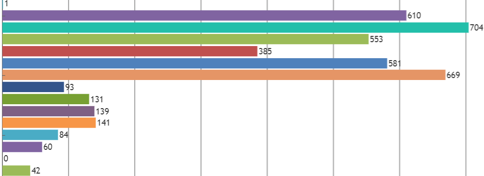
}So currently the chart looks like this, which is not very helpful:
Firstly suppliers names do not appear on the chart, but this is to be expected as I removed them intentionally with this code:
  axisX: {
		titleFontSize: 20,
		labelFontSize: 14,
		tickPlacement: "inside",
		stripLines: stripLinesArray,
		//removes all labels from axisX, later on they are added but as stripLines and with colors.
		labelFormatter: function(e) { return "";}
	  },
I will explain why I chose to do that later. The second reason why this chart is not helpful, is that all the bars in this chart have different colours as it is still using default chart colour settings. Sorting this out is my next objective 😉