Chart Samples For CHEP Pallets Report
While developing CHEP Pallets Report web dashboard I made 4 excel chart samples that convey the concept of charts to be used in this dashboard. The Excel file containing all 4 chart samples can be found here.
The 4 chart samples are these:
- Total transfers by type.
- Total pallets IN and OUT.
- Monthly pallet transfers by type.
- Monthly pallet transfers by supplier.
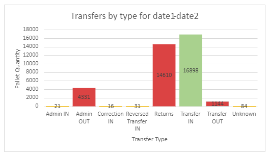
Total transfers by type chart
This chart displays total pallets transferred for each transfer type for the time period. As there are 8 transfer types this chart consists of 8 columns.
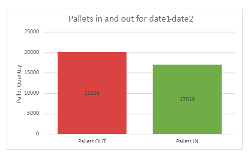
Total pallets IN and OUT chart
This chart has two columns that display sum of pallets transferred to site and a sum of pallets transferred out of site for the time period.
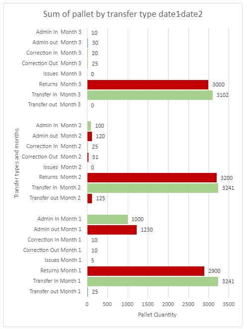
Monthly pallet transfers by type chart
This chart displays sum of pallets for each month grouped by transfer type. As there are 8 transfer types in total, each month’s chart contains 8 bar charts.
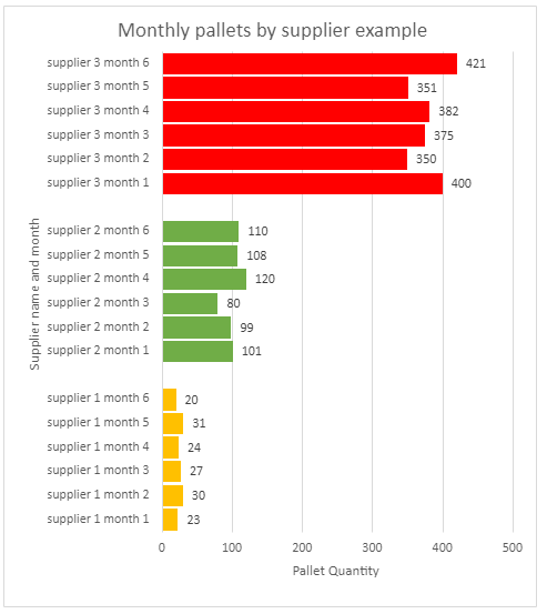
Monthly pallet transfers by supplier
This chart displays a sum of pallets transferred by supplier for each month.