
So I had some spare time after holidays and used to to improve Flickerbook’s YOY charts. I have added 6 new charts to YOY page:
- YOY Monthly Net Pay
- YOY Monthly Days
- YOY Monthly Hours
- YOY Weekly Days
- YOY Weekly Hours
- YOY UK Weekly Work Hours
I will explain each of the chart individually.
YOY Monthly Net Pay
As the name suggests this chart displays monthly net pay, gross pay and deductions for the chosen period of time. It is calculated by dividing each years net, gross pay and deductions by 12.
	ROUND(COALESCE(SUM(total),0)/12,2) AS monthlyTotalDeductions,
	ROUND(COALESCE(SUM(net_pay),0)/12,2) AS monthlyNetPay,
	ROUND(COALESCE(SUM(gross_pay),0)/12,2) AS monthlyGrossPay,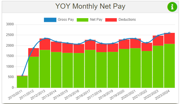
Though the chart itself is practically identical to YOY net pay chart, I still want to have it as I find it helpful to know how my monthly earnings compare year over year.
YOY Monthly Days
Now this chart is a new addition, as I didn’t have anything like this before, and I’m happy I came up with it. It displays 3 types of days on a bar chart:
- Days in
- Days off
- Leave days
The leave days is a sum of days that work was not attended (like holiday, sick, paternity).
The calculation of it is quite simple. I have 3 columns in the database, where I store weekly days in, days of and leave days. The days off column had to be created just for this chart. The monthly value is calculated by dividing a SUM of days over a tax period by 12:
	ROUND(SUM(daysInPerWeek)/12,2) AS daysInPerMonth,
	ROUND(SUM(leaveDaysPerWeek)/12,2) AS leaveDaysPerMonth,
	ROUND(SUM(daysOffPerWeek)/12,2) AS daysOffPerMonth,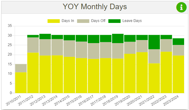
What this chart helped me realise is that I have less day off’s then I used to. It’s mainly due to the fact that after changing job position the only overtime I can do is on my day off over the weekend and there are no more early starts or late finishes.
To be honest this is something I would like to improve and have more time off, as currently I’m either working or I’m on holidays and my social life is a paying the price for that.
YOY Monthly Hours
This chart simply displays all hours in a bar chart for every tax year selected. Hours are summed up for every tax year and the they are divided by 12 to get the monthly average value.
                ROUND(((COALESCE(SUM(basic_h),0) + COALESCE(SUM(missBasicHours),0))/12),2) AS monthlyBasicHours,
		ROUND(((COALESCE(SUM(ot1_units),0) + COALESCE(SUM(missOT1Hours),0)+COALESCE(SUM(ot2_units),0) + COALESCE(SUM(missOT2Hours),0))/12),2) AS monthlyOvertimeHours,
		ROUND(((COALESCE(SUM(hol_units),0) + COALESCE(SUM(missHolidayHours),0)+COALESCE(SUM(enhol_units),0) + COALESCE(SUM(missEnHolidayHours),0))/12),2) AS monthlyHolidayHours,
		ROUND(((COALESCE(SUM(sick_units),0) + COALESCE(SUM(missSicknessHours),0))/12),2) AS monthlySicknessHours,
		ROUND(((COALESCE(SUM(fam_units),0) + COALESCE(SUM(missPaternityHours),0))/12),2) AS monthlyFamHours,
		ROUND(((COALESCE(SUM(ber_units),0) + COALESCE(SUM(missBerHours),0))/12),2) AS monthlyBerHours,
		ROUND(((COALESCE(SUM(comp_units),0) + COALESCE(SUM(missCompHours),0))/12),2) AS monthlyCompHours,
		ROUND(((COALESCE(SUM(unpaidBreaks),0)+COALESCE(SUM(unpaidBreaks2),0))/12),2) AS monthlyUnpaidBreaks,
		ROUND(((COALESCE(SUM(fur_units),0) + COALESCE(SUM(missFurHours),0))/12),2) AS monthlyFurloughHours,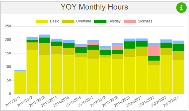
YOY Weekly Days
This chart displays similar data to YOY monthly days, but I still decided to create as I wanted to have this data. It also displays 3 types of days: days in, days off and leave days. The averages are calculated by getting the sum of days and then dividing it by either 52 or 53, depending on how many weeks are in the tax year (this value in my code is stored in a variable named $taxPeriodQuantityFull).
ROUND(SUM(daysInPerWeek)/$taxPeriodQuantityFull,2) AS daysInPerWeek,
ROUND(SUM(leaveDaysPerWeek)/$taxPeriodQuantityFull,2) AS leaveDaysPerWeek,
ROUND(SUM(daysOffPerWeek)/$taxPeriodQuantityFull,2) AS daysOffPerWeek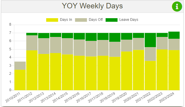
YOY Weekly Hours
This chart is similar to monthly hours chart, but the sum of hours are divided from either 52 or 53 depending on the tax year instead of 12.
		ROUND(((COALESCE(SUM(basic_h),0) + COALESCE(SUM(missBasicHours),0))/$taxPeriodQuantityFull),2) AS avgBasicHours,
		ROUND(((COALESCE(SUM(ot1_units),0) + COALESCE(SUM(missOT1Hours),0)+COALESCE(SUM(ot2_units),0) + COALESCE(SUM(missOT2Hours),0))/$taxPeriodQuantityFull),2) AS avgOvertimeHours,
		ROUND(((COALESCE(SUM(hol_units),0) + COALESCE(SUM(missHolidayHours),0)+COALESCE(SUM(enhol_units),0) + COALESCE(SUM(missEnHolidayHours),0))/$taxPeriodQuantityFull),2) AS avgHolidayHours,
		ROUND(((COALESCE(SUM(sick_units),0) + COALESCE(SUM(missSicknessHours),0))/$taxPeriodQuantityFull),2) AS avgSicknessHours,
		ROUND(((COALESCE(SUM(fam_units),0) + COALESCE(SUM(missPaternityHours),0))/$taxPeriodQuantityFull),2) AS avgFamHours,
		ROUND(((COALESCE(SUM(ber_units),0) + COALESCE(SUM(missBerHours),0))/$taxPeriodQuantityFull),2) AS avgBerHours,
		ROUND(((COALESCE(SUM(comp_units),0) + COALESCE(SUM(missCompHours),0))/$taxPeriodQuantityFull),2) AS avgCompHours,
		ROUND(((COALESCE(SUM(unpaidBreaks),0)+COALESCE(SUM(unpaidBreaks2),0))/$taxPeriodQuantityFull),2) AS avgUnpaidBreaks,
		ROUND(((COALESCE(SUM(fur_units),0) + COALESCE(SUM(missFurHours),0))/$taxPeriodQuantityFull),2) AS avgFurloughHours,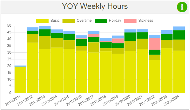
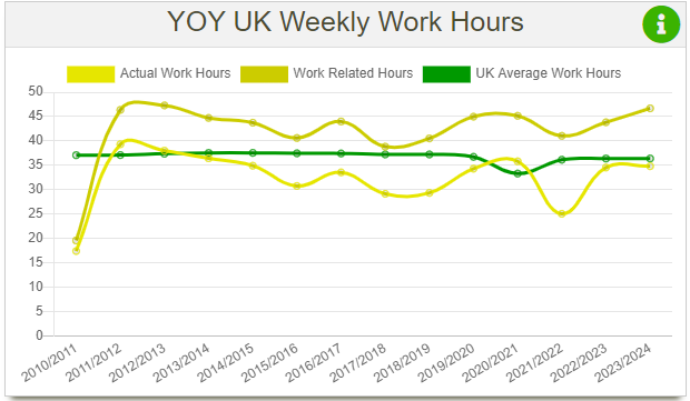
YOY UK Weekly Work Hours
This chart was created in order to compare working hours to UK average work hours. I have found statistics on UK average work hours per week on:
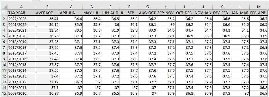
However the data on this site is provided for 3 months averages, so I had to create an excel file and calculate averages from April to April, to match each tax year.
Another issue I encountered is that I’m not sure how these average work hours are calculated, as I’m unaware if paid or unpaid breaks are included in the calculation. Same thing goes for leave days. As the average always is around 36-37 hours, that resembles a 7.5h a day for 5 days a week, and if a person works like this and takes his annual leave, the average should be lower then 37.5 over the period of a year. For example if I work 7.5h a day and 5 days a week, over a tax year that would be a sum of 1950 hours (7.5*5*52), if I take 20 days of holidays, that would mean I have 150 hours of work (7.5*20) , which reduces the total amount of hours worked to 1800. That would mean that over a year my average hours at work would amount to 34.6 (1800/52). Of course there is a case of overtime, but if I deduct leave hours from total hours, that means that in order to get the average back to at least 36.5 a person would need to do 100 hours of overtime over a tax year.
Since I can’t determine how exactly these average hours are calculated I have added two more line charts:
- Actual work hours
- Work related hours
Actual work hours only include work hours (basic hours + overtime hours – paid break hours). Work related hours is a sum of all hours like, basic, overtime, holiday, sick and so on.
ROUND(((COALESCE(SUM(basic_h),0) + COALESCE(SUM(missBasicHours),0) + COALESCE(SUM(ot1_units),0) + COALESCE(SUM(missOT1Hours),0) + COALESCE(SUM(ot2_units),0) + COALESCE(SUM(missOT2Hours),0) - COALESCE(SUM(paidBreaks),0)) /$taxPeriodQuantityFull),2) AS actualHoursWorkedWeeklyAverage,

ROUND(((COALESCE(SUM(basic_h),0)+COALESCE(SUM(ot1_units),0) + COALESCE(SUM(ot2_units),0) + COALESCE(SUM(leaveHoursPerWeek),0) + COALESCE(SUM(missBasicHours),0)+ COALESCE(SUM(missOT1Hours),0) + COALESCE(SUM(missOT2Hours),0)) /$taxPeriodQuantityFull),2) AS weeklyWorkRelatedHoursAverage,
An example of this chart is demonstrated below:
Conclusion
I believe that after adding these new charts to the Flickerbooks YOY page, it can be declared as completed. But you never know, I might come up with something new. Other than that there are just minor things left to work on on the YOY section and after that I can move on on improving other sections of the website. And I have plenty of work on the horizon as I need to redo back pay calculator and shift generator.