
In this post I will finally explain why I chose to remove default labels with suppliers names. While looking for ways to improve this chart, I decided to colour each suppliers name on this chart with the same colour as it’s bar charts. And while researching on how to do it, I came across this code on https://canvasjs.com/forums/topic/different-colors-for-labels/
function changeAxisLabelColor(chart) {
    var dps;
    for(var i = 0; i < chart.data[0].dataPoints.length; i++){
        dps = chart.data[0].dataPoints[i];
        if(dps.labelFontColor)
            chart.axisX[0].addTo("stripLines", { value: dps.x, label: dps.label, labelPlacement: "outside", labelBackgroundColor: "white", color: "transparent", labelFontColor: dps.labelFontColor });
    }
}
What this code does, it adds labelFontColor to each stripline, and places it ouside the chart instead of the original label. In order for this code to work properly, the original labels have to be removed from the chart. To achive that this code must be added to the charts rendering function (marked in green in the sample code below):
  axisX: {
		titleFontSize: 20,
		labelFontSize: 14,
		tickPlacement: "inside",
		stripLines: stripLinesArray,
		//removes all labels from axisX, later on they are added but as stripLines and with colors.
		labelFormatter: function(e) { return "";}
	  },
At first I coded it the same way at it was demonstrated it this example, but this had a downside, as rendering the chart, then looping through every labelFontColor made the chart rendering slow. As I already have an array were I store some values for stripLines, I decided to use it again and just add more values to it. So I placed this line of the code, inside the inner “for” loop in the organizeDataForChart1() function:
stripLinesArray.push({value: (monthCount*i+x), label: label, labelPlacement: "outside", labelBackgroundColor: "white", color: "transparent", labelFontColor: colorArray[colorIndex]});By doing so I achieve same visual result for the chart, but it saves me from having to first generate a chart, and then loop trough every generated stripLine and update it’s colour. The code responsible for colouring each suppliers name inside organizeDataForChart1() function is demonstrated below:
	        let label = "";
	        let stripLinesArray = [];
		let colorIndex = 0;
		for (let i =0; i< supplierCount; i++ ){
			 for (let x=0; x< monthCount; x++){
				label = distinctSuppliersNamesArray[i]+" "+distinctMonths[x];
				stripLinesArray.push({value: (monthCount*i+x), label: label, labelPlacement: "outside", labelBackgroundColor: "white", color: "transparent", labelFontColor: colorArray[colorIndex]});
			 }
			colorIndex++;
			 if(colorIndex === 10) {colorIndex = 0;}
		 }
Once the stripLinesArray is filled, it is sent to renderChart1() function.
renderChart1(colorArrayForChart1, stripLinesArray, dataPointsArray); How this code blends inside Javascript is demonstrated below, by highlighting relative code with green background.
const renderChart1 = (colorArrayForChart1, stripLinesArray, dataPointsArray) => {
CanvasJS.addColorSet("customColorSet1", colorArrayForChart1);
let chart = new CanvasJS.Chart("chart1InnerContainer", {
theme: "light1",
animationEnabled: true,
exportEnabled: true,
colorSet: "customColorSet1",
title: {
text: "Monthly pallet transfers by supplier",
fontSize: 20,
},
axisX: {
titleFontSize: 20,
labelFontSize: 14,
tickPlacement: "inside",
stripLines: stripLinesArray,
//removes all labels from axisX, later on they are added but as stripLines and with colors.
labelFormatter: function(e) { return "";}
},
axisY2: {
title: "Pallet Quantity",
titleFontSize: 14,
labelFontSize: 14,
includeZero: true,
},
data: [{
type: "bar",
indexLabelFontSize: 14,
axisYType: "secondary",
indexLabel: "{y}",
dataPoints: dataPointsArray
}]
});
chart.render();
}
//in this array I will store individual colors for chart 1
const colorArray = ["#408000", "#b3b300", "#cc3300", "#0059b3", "#cc7a00", "#5c5c8a", "#739900", "#997300", "#990073", "#2d5986"];
const organizeDataForChart1 = (chartData, distinctSuppliersNamesArray, distinctMonths) => {
//count object keys to determine the length of the object
let supplierCount = Object.keys(distinctSuppliersNamesArray).length;
let monthCount = Object.keys(distinctMonths).length;
//if supplier count at least 1, a chart will be drawn, else an empty chart will be drawn.
if (supplierCount > 0) {
//these array's will be filled inside the loops, and later passed to renderChart1 function
let colorArrayForChart1 = [];
let dataPointsArray = [];
//a variable to store suppliers name+month value.
let label = "";
let y;
let stripLinesArray = [];
//start/end values for strip line
let startValue =-0.5; //because the bar chart is in the middle of zero, it startas at -0.5 and ends at 0.5
let endValue = monthCount - 0.5;
//color for strip line
let color ="#e6e6e6";
let colorIndex = 0;
for (let i =0; i< supplierCount; i++ ){
//compose the array for dataPoints that will be used to draw the chart
for (let x=0; x< monthCount; x++){
label = distinctSuppliersNamesArray[i]+" "+distinctMonths[x];
y = chartData[distinctSuppliersNamesArray[i]][distinctMonths[x]];
dataPointsArray.push({label, y});
//fill array color
colorArrayForChart1.push(colorArray[colorIndex]);
///COLOUR SUPPLIERS NAME WITH MONTH VALUE
stripLinesArray.push({value: (monthCount*i+x), label: label, labelPlacement: "outside", labelBackgroundColor: "white", color: "transparent", labelFontColor: colorArray[colorIndex]});
}
colorIndex++;
//if all 10 colors in the color array has been used, reset the counter, and start filling the colorArrayForChart1 with
if(colorIndex === 10) {colorIndex = 0;}
//draw a grey strip line on the chart for every second supplier
if(i==0) {
//add default values on first iteration
stripLinesArray.push({startValue, endValue, color});
} else if (i % 2 == 0) {
startValue+=(monthCount*2);
endValue+=(monthCount*2);
stripLinesArray.push({startValue, endValue, color});
}
}
//call the function to render the chart
renderChart1(colorArrayForChart1, stripLinesArray, dataPointsArray);
} else {
//draw empty chart
}
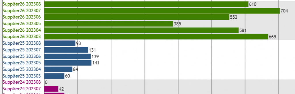
}Once this was implemented the results of the chart looks like this:
To be honest I’m satisfied with this result, as by adding grey colour to every second suppliers bar charts, and colouring each suppliers name on the label axis I achieved more than I initially intended for this chart. But there a few more things I need to do before moving to coding the remaining 3 charts. But about that it my next post 😉